Facebook Paper: the low-down for brands
Despite recently-raised (but largely unfounded) concerns over Facebook’s continued dominance in the social networking space, due to its sheer size and influence, when Facebook makes a play, businesses are forced to take note. Today we’re taking a closer look at their latest mobile app release: Facebook Paper. Currently only available in the US on iPhones and iPod Touches, Facebook have plans to roll this out in other territories and for the Android operating system. Find out what it is and what it is likely to mean for brands…
What is it?
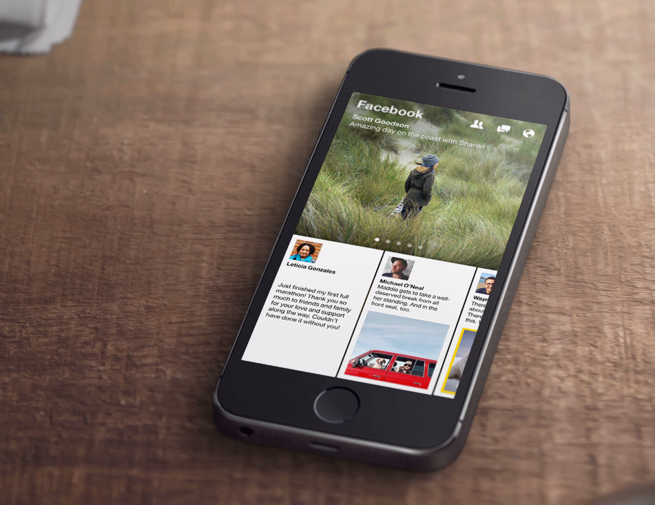
So, instead of displaying a single news feed full of posts from your friends, Paper is designed to be more like a newspaper, with sections on broad topics and interests such as food, sports, science or art. It’s not dissimilar to Flipboard in layout. Users can browse curated content from around the web, chosen and highlighted by a human editorial team. Coverage is divided into categories such as ‘Headlines’ (current affairs) ‘Well Lived’ (health), ‘Cute’ (animals), ‘Glow’ (beauty) and ‘LOL’ (funnies) etc. Users are also limited to 10 different sections from a total of 20 choices to limit the information appearing in the feed. There’s also a section called ‘Facebook’ displaying stories from the users’ friends and from the pages he or she follows. Status updates and posts are reimagined as magazine-like spreads.
An immersive design
Paper is designed to be more immersive than the Facebook website or its mobile application (which we gather is here to stay – this is an alternative rather than a replacement). There are no borders around the application: no buttons, search boxes or interface elements. Instead, Paper uses the phone’s entire screen to display pictures, videos and stories. The effect is slick and polished, and makes the main Facebook mobile app look clunky by comparison.
Paper will still share Facebook messaging, friend requests and story share functions, but they will be built seamlessly into the design. Moreover, Paper surfaces only news stories from select publishers based on your own specific interests in topics, rather than showing you pages you’ve already liked, that might surface two or more times in the classic news feed.
What will this mean for brands?
Advertising
So far so ad free. This could soon change though. It’s likely Facebook will be very particular about this space – they won’t want to flood new users with unwanted ad content. It is likely they will begin by inviting big brands to create episodic content that informs, intrigues and entertains in a manner alike to the unbranded content that will be offered via the app.
Keep it visual
Facebook has been giving preference to visual content (images and videos) for a long time but Facebook Paper looks set to take this to a whole new level. The full screen image and video autoplay capabilities are there to support a highly visual approach. Brands will need to be thinking about how they can make a visual impact first and foremost.
Content, content, content!
Brands will need to offer Facebook Paper users a rich content experience comprising attention-grabbing images, compelling headlines and embedded video. Interestingly, the layout of Facebook Paper lends itself very well to the consumption of longer form content. With a commitment to quality and a keen awareness of their audience’s tastes, interests and content-consumption preferences, brands should have no trouble making the most of this opportunity.
Planning is everything
We’ve said it before and we’ll say it again: planning is everything. To get the most out of Facebook you must take the time to plan your approach, combining the proactive with the reactive. We help our clients set-up editorial calendars for each social media platform they have a presence on, in line with their brand plans, helping them to provide their social media audiences with the rich, diverse posts and updates they come to crave.


Leave a Reply